Learn the essential elements of creating a captivating OnlyFans banner that will attract more subscribers and boost your earnings. Discover the key design elements and tips to make your banner stand out and grab attention.
As an OnlyFans content creator, your banner is the first thing potential subscribers see when they visit your page. It’s your opportunity to make a great first impression and showcase your brand identity. Therefore, designing an eye-catching OnlyFans banner is crucial to attract more subscribers and boost your earnings.
In this article, we’ll dive into the key elements of designing a captivating OnlyFans banner. We’ll cover everything from the design elements to tips for making your banner stand out and grab attention.
So, let’s get started on designing an eye-catching OnlyFans banner!
The Importance of an OnlyFans Manager for Your Success
Managing an OnlyFans account effectively can be a full-time job. From creating content and engaging with subscribers to handling marketing and communications, the workload can quickly become overwhelming. This is where hiring an OnlyFans manager can make all the difference.
An OnlyFans manager provides expertise and support in areas like content strategy, subscriber growth, and account optimization. By delegating tasks such as responding to messages, promoting your account, and analyzing metrics, you can focus on what you do best—creating captivating content.
While some creators hesitate to hire a manager due to cost or concerns about control, working with the right manager can actually save time and boost your earnings. A good manager will align with your brand vision and goals, ensuring that your OnlyFans account thrives.
Ultimately, partnering with a manager allows you to balance creativity with business growth, making it an invaluable investment for long-term success.
Key Elements for Designing an Eye-Catching OnlyFans Banner
Design Elements for an Eye-Catching OnlyFans Banner
– Colors
– Typography
– Images
Tips for Making Your Banner Stand Out
– Keep It Simple
– Be Creative
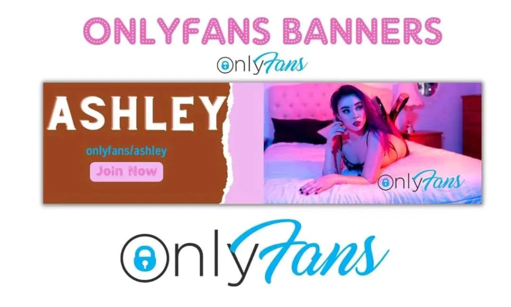
– Use a Call to Action
– Use High-Quality Images
– Use Branding
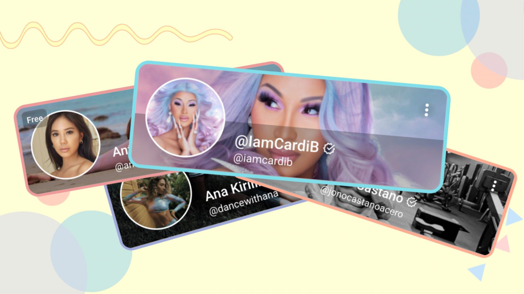
Essential Tips for Crafting a Standout OnlyFans Banner:
Colors
When designing an OnlyFans banner, choosing the right colors is crucial. Colors play a significant role in creating a visual impact and conveying your brand identity. Therefore, you need to choose colors that align with your brand and appeal to your target audience.
One tip for choosing colors is to use your brand’s primary color as the dominant color in your banner. This helps create brand recognition and consistency across your social media platforms.
Typography
Typography is another essential design element that can make or break your OnlyFans banner. Choosing the right font can help communicate your message, evoke emotions, and create a visual hierarchy.
When choosing a font, make sure it’s easy to read and aligns with your brand’s personality. For instance, if you have a playful brand, you might opt for a fun and whimsical font. On the other hand, if you have a more serious brand, you might choose a font that is clean and straightforward.
Images
Images are one of the most effective ways to grab attention and convey your message. Therefore, it’s essential to choose high-quality images that align with your brand and message.
One tip for choosing images is to use images that evoke emotions and tell a story. For instance, if you’re a fitness influencer, you might choose images of yourself working out or before-and-after photos of your clients. This not only showcases your expertise but also helps potential subscribers visualize their transformation.
Tips for Making Your Banner Stand Out
Keep It Simple
When it comes to designing an OnlyFans banner, less is more. You want to avoid cluttering your banner with too many elements, as this can overwhelm and confuse potential subscribers.
Instead, opt for a simple and straightforward design that highlights your brand and message. Use a clear and concise headline, high-quality images, and a call to action to guide potential subscribers to take action.
Be Creative
While it’s essential to keep your OnlyFans banner simple, you also want to be creative and stand out from the crowd. Think outside the box and incorporate unique design elements that align with your brand and message.
For instance, you might use an animated GIF to showcase your products or services.
Use a Call to Action
A call to action (CTA) is a crucial element of any marketing material, including your OnlyFans banner. A CTA encourages potential subscribers to take action, whether it’s signing up for your page, checking out your content, or purchasing your products.
Make sure your CTA is clear and concise, and placed prominently on your banner. You can use action-oriented words like “subscribe now” or “join today” to create a sense of urgency and encourage potential subscribers to take action.
Use High-Quality Images
As mentioned earlier, high-quality images are essential for creating an eye-catching OnlyFans banner. Make sure your images are clear, well-lit, and visually appealing.
You can use free stock images or take your own photos. However, if you choose to take your own photos, make sure they are of high quality and showcase your brand and message effectively.
Use Branding
Your OnlyFans banner should reflect your brand identity and personality. Therefore, it’s essential to incorporate branding elements into your banner, such as your logo, brand colors, and tagline.
Using branding elements not only helps create brand recognition but also makes your banner look more professional and cohesive. Make sure your branding elements are prominent but don’t overpower your message.
FAQs
What Size Should an OnlyFans Banner Be?
The recommended size for an OnlyFans banner is 1600 x 400 pixels. However, make sure to check the platform’s guidelines to ensure your banner meets their requirements.
Can I Use a Template for My OnlyFans Banner?
Yes, you can use a template for your OnlyFans banner. There are several free and paid templates available online that you can customize to fit your brand and message.
Do I Need to Hire a Designer to Create My OnlyFans Banner?
No, you don’t necessarily need to hire a designer to create your OnlyFans banner. However, if you’re not confident in your design skills, or if you want a more professional-looking banner, you might consider hiring a designer.
Designing an eye-catching OnlyFans banner is essential to attract more subscribers and boost your earnings. When designing your banner, make sure to incorporate the key design elements, such as colors, typography, and images. Also, use tips like keeping it simple, being creative, using a call to action, and incorporating branding to make your banner stand out.
Remember, your OnlyFans banner is your first impression on potential subscribers. Therefore, take the time to design a captivating banner that reflects your brand and personality. With these key elements and tips, you can create an eye-catching OnlyFans banner that drives more subscriptions and boosts your earnings.

